How Low Color Contrast is Hurting Your Website, Substack & Instagram Conversions
This is something I notice almost daily as I peruse Instagram and Substack. I truly believe it is not an intentional choice, but more of a DIY mistake, which is why I am writing this article to help educate and improve. We will start by defining the problem.
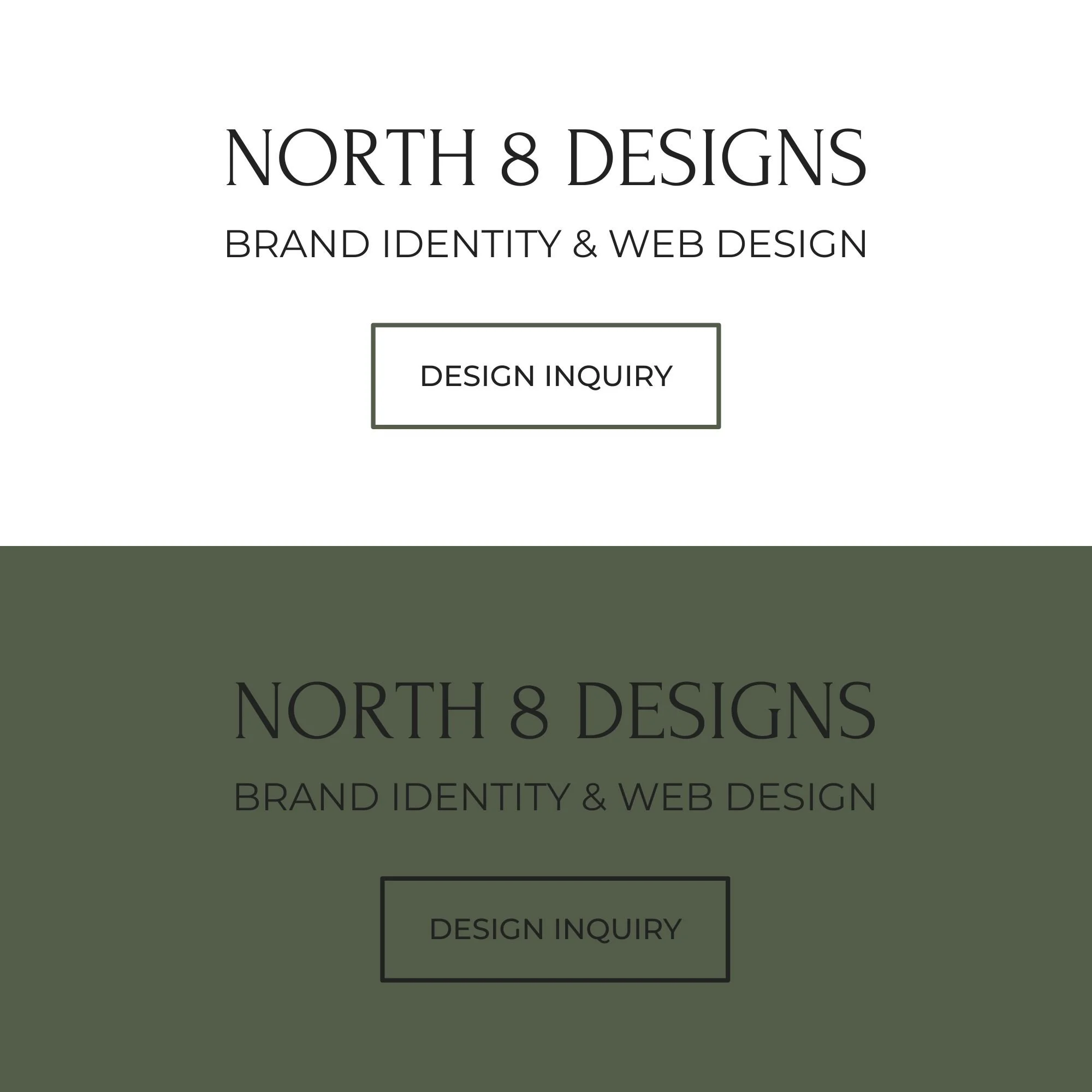
Here is a simple example of good vs. poor color contrast using my logo and brand colors.
The top graphic has sufficient color contrast against the neutral background.
The bottom graphic with the black text against a green background is an absolute fail. In contrast, the same graphic in green with white text and details would pass most accessibility tests.
What is color contrast?
Color contrast is the difference in brightness and color between two things that are next to each other. For example, the text you are reading in this blog post (black) and the background behind it (creamy white).
Think of it as the "pop" factor. High contrast (like black text on a white background) is sharp and easy to see. Low contrast (like light gray text on a white background, or yellow text on an orange background) blends together and makes you squint.
Why does color contrast matter?
Readability: If your contrast is too low, people literally cannot read your content. If they have to strain their eyes, they will scroll right past your post or leave your website.
Accessibility: Millions of people have visual impairments, color blindness, or are just looking at their phones outside in bright sunlight. Good contrast ensures everyone can consume your content. If your target audience is anyone over 40, they likely struggle with this.
Calls to Action (Conversions): If your "Buy Now" or "Subscribe" button blends into the background, no one will click it. You lose followers and money simply because your design is invisible. Or if you are advertising a service on Instagram, people will scroll on by on to the next because they can’t read the text sharing the service details.
Why your trendy minimalist palette might be driving potential subscribers and customers away:
The Short Answer: Your aesthetic looks gorgeous, but if your audience has to squint to read it, they’re going to scroll right past it.
I love a clean, minimalist palette as much as the next designer—just look at my own branding for North 8 Designs. But there is a fine line between "effortlessly chic" and "completely invisible."
Over 90% of Instagram users view content on their phones, making mobile readability one of the most important factors in engagement and conversion.
When you consider that over 90% of Instagram users view content on their mobile phones, readability becomes your ultimate conversion metric. Out in the real world, people are looking at your content on cracked screens, in low light, or outside in bright sunlight. If your trendy pastel text or low-contrast graphics blend into the background, you aren't just losing views. You are actively driving away potential subscribers and customers who simply give up trying to read your message.
When you hit publish on Substack, up to 95% of your initial views happen inside an email inbox, and roughly two-thirds of your audience is reading on a mobile phone.
This means they aren't looking at your beautiful web layout; they are looking at a tiny screen, likely inside a crowded Gmail app, potentially walking down the street or sitting in a brightly lit room.
On Substack: Low contrast means people physically cannot read your 1,000-word newsletter, leading to high unsubscribe rates and low link clicks. If your email layout uses low-contrast text, they will hit 'delete' before they even read your first sentence.
Beyond typography, I’ve noticed a growing trend of Substack creators using dark backgrounds with white text on their websites. While a dark mode aesthetic can look sleek on the web, it falls apart in the inbox because Substack doesn't let you customize email background colors.
This creates a major disconnect when a reader clicks through from their inbox to leave a comment or like a post. Being suddenly thrown from a bright white email to a pitch-black website is a shock to the ol’ eyes. This jarring visual shift creates an off-putting user experience that breaks your brand's seamless flow.
How to Test Your Brand Colors for Accessibility:
Minimalism doesn't have to mean unreadable. You can keep your aesthetic and keep your audience; you just have to know how to adjust.
Checking your palette takes less than two minutes and ensures your content is actually working for you, not against you. Instead of guessing if your text "pops" enough, run your brand colors through these free, industry-standard tools:
WebAIM Contrast Checker: This is my favorite tool as a designer for a quick check. Plug in your font color and background color hex codes to see a definitive pass or fail grade based on official web accessibility guidelines.
Adobe Color Contrast Analyzer: If you prefer a highly visual interface, Adobe's tool allows you to test your ratios in real-time and even simulates different types of color blindness so you can see exactly how your audience experiences your graphics.
At the end of the day, a great design isn't just about what looks pretty on a desktop monitor. We have to keep in mind reality and how it performs on a cracked iPhone screen in the middle of a sunny afternoon. Or how it looks in a dark room when someone is doomscrolling at night before bed. We all know we're not supposed to do it, but who's guilty? If you are concerned that your current brand colors are quietly draining your engagement or costing you paid subscribers, you don’t have to guess your way through a solution.
Let's look at your visual strategy together and tighten up your color choices to better reflect your brand vibe AND improve accessibility along with conversion.