Clean Lines, Clear Content: The Art of Streamlined Blogging on Squarespace
Have you ever clicked on a blog and immediately felt overwhelmed by all the information crammed onto the page? Same. I’ve been following blogs for over 14 years now, and as much as I love them, I’ve definitely hit that point where I just exit the site because my eyes don’t know where to land. And don’t even get me started on recipe blogs—sometimes it feels like you have to scroll through an entire memoir just to get to the actual recipe.
So whenever I get the chance to design a website that includes a blog, I always keep that in mind. My goal is to create a space that feels calm and easy to navigate—something that makes sense for the user and doesn’t leave them feeling overwhelmed or frustrated. Clean layouts, clear content, and an on-brand experience are always part of the design strategy.
Last year, I had the chance to design a blog for a content creator I’ve personally followed for years—and I was so excited to help refine the layout and overall look to avoid that overwhelming, cluttered feel. Squarespace ended up being the perfect platform for this project for so many reasons—especially how easy it is for the business owner to manage and update content. But today, I want to zoom in on one specific part: the streamlined design. We’re going to take a closer look at this blog over a year after launch and see how beautifully this creator and her team have continued to grow and maintain the site.

This is one of my favorite pages on this site. It stays fresh and up-to-date, and I love how Amy shares quick, bite-sized favorites that link straight to the product.
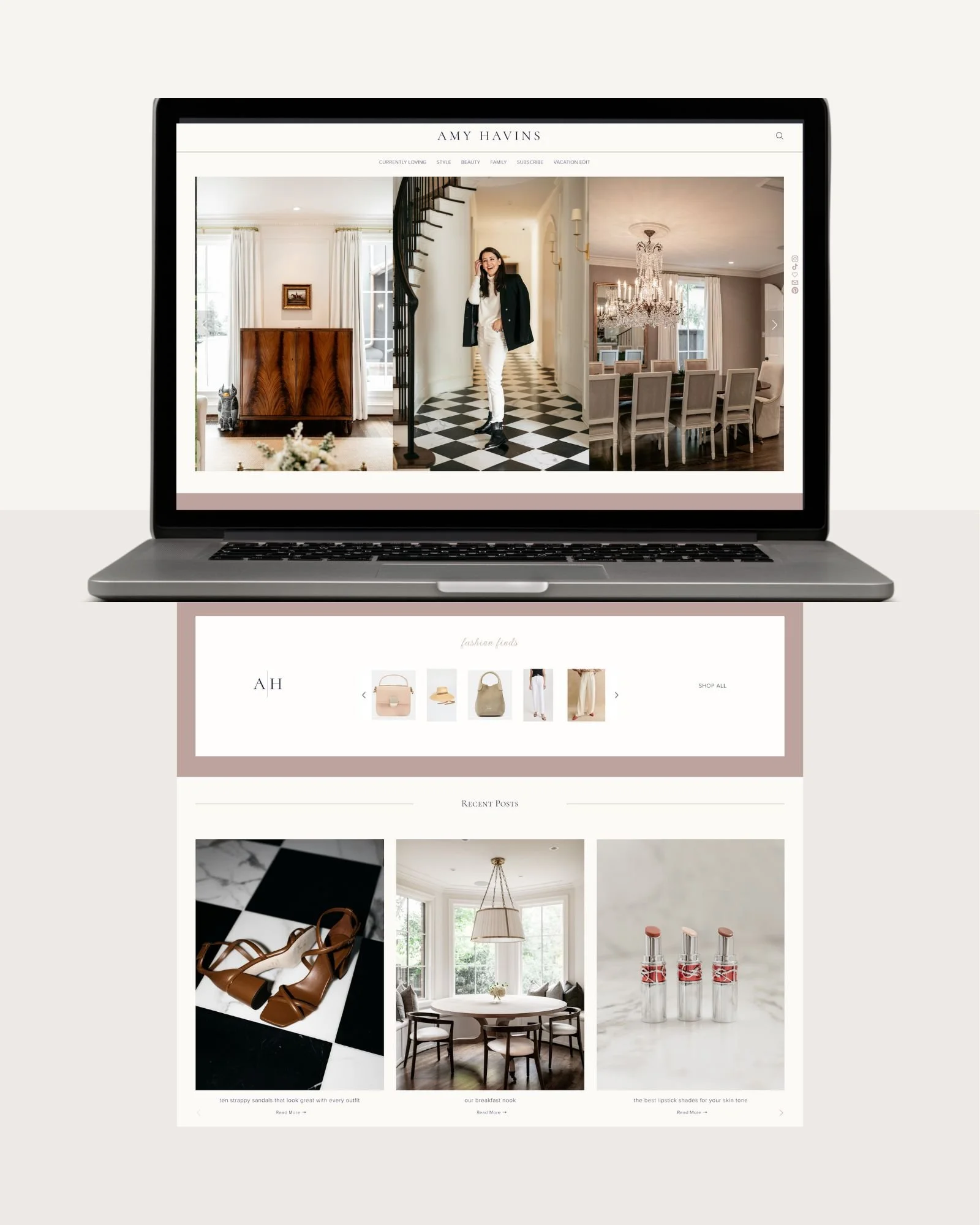
Clear & Straightforward Menu with Search
It is so common to land on a blog and immediately feel lost in a sea of menus—one across the top, another hidden behind a three-bar mobile menu, and sometimes even more buried in drop-downs. Just trying to find the search function can feel like looking for a needle in a haystack. But with this site, the navigation is refreshingly simple. There are just six clear page options, all linked right at the top and center, with a magnifying glass icon for search tucked neatly in the top right corner.
One thing I really love about the search feature on this site is the custom pop-up. It gives users the option to either search the blog itself or jump straight to LTK to find a link—which is especially helpful since so many people land on a blog looking for something they saw on Instagram or TikTok. Having this built into a sticky (or frozen) header means the search is always just a click away. It’s a small detail that makes a big difference for user experience.
Homepage Layout
Just a short scroll from the top, you’ll land on the “Fashion Finds” section—frequently updated with LTK links, which is perfect since fashion is the core focus of this blog. It keeps things fresh and shoppable, right where readers expect it. Right below that, you’ll find “Recent Posts,” giving readers instant access to the latest blog content without needing to sift through menu tabs. It’s all about reducing clicks and making content easy to access. The rest of the homepage is filled with thoughtfully curated content areas, like a feed of recent Instagram posts and the opportunity to subscribe for future blog updates—keeping everything connected and encouraging repeat visits.
At the very bottom, the footer ties everything together. It includes commonly visited links and archives from Amy’s original blog, Dallas Wardrobe. A quick peek at both the new and old pages shows how we took the strong foundation of her original blog and transformed it into a clean, elevated, and streamlined version that reflects her brand today.
Homepage Snapshot of amyhavins.com

Beauty Blog Page
Here is a peek at how the Beauty page is organized. It follows a similar layout to the homepage, with recent beauty favorites shoppable right at the top. Below that, you’ll find the "Recent Beauty Posts" section, stacked neatly for easy browsing. Clicking the “Load More” link will open more beauty blog posts to explore.
I absolutely love how neat and organized everything is and how each blog category follows the same layout. This consistency makes it super easy for users to instantly recognize the type of content they’re looking for. Whether they want to find something specific quickly or just spend time browsing and reading, the layout makes it simple and enjoyable.
The Edit Page
The last page of the site that I love equally as much as the “Currently Loving” page is the seasonal “The Edit” page. Amy and her team do such a great job keeping it fresh and updated with curated picks that reflect the current season. The example below is perfect for this time of year, especially with everyone heading out for spring break trips. It’s such a smart way to spotlight timely, seasonally appropriate content through a clean grid of linked images. Straightforward, easy to find, and fun to explore—this section is a favorite for a reason.

If you’re interested in learning more about blogging on Squarespace—or if you’re ready to streamline your own blog—I’d love to chat. Feel free to reach out!